The Psychology Behind Shop Front Signage Colors
The first impression of a business comes through the attractive and effective name you give it. Next, place the name in front of the shop. Signage installation is an art and a strategic representation that grabs customers’ attention with an attractive mix of fonts, colors, layouts, and materials.
Moreover, effective signage boosts walk-ins, evokes emotions, and creates curiosity about the shop. That is why Zebra Signage is the best signage solution hub in Trivandrum, providing customized store name board design for your business and placing it in the right spot to capture attention from passersby.
In this blog, we explore the psychology behind shopfront signage colors.
Colors that demand attention
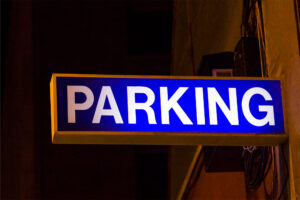
Red, orange, and yellow are colors that usually stand out clearly—even at night. Among them, red often indicates urgency and is widely used for flash sales. In fact, red-colored signage is commonly placed at the storefront to announce sales promotions, discounts, limited-time deals, and special offers that immediately attract customers.
Moreover, restaurants are places where red signage functions especially well. This color stimulates appetite and excitement, making it a perfect choice for fast-food shops, bakeries, or snack counters. Additionally, gyms, gaming zones, and sports stores also benefit from red signage because it energizes and excites customers. On the other hand, orange and yellow serve as slight variations of red. Orange adds excitement and is well-suited for toy shops or boutique stores, while yellow brings a cheerful, optimistic vibe that instantly catches the eye.
Colors That Build Trust & Quality
Blue and green colors provide a calm and soothing experience for your business. If your business is related to health, wellness, or nature, blue and green are the best choices for signage. Specifically, blue creates a sense of calm and builds trust among customers, while eco-friendly and wellness brands often use green to convey a connection with nature. Together, these colors create credibility and comfort for your audience. However, dark shades of blue and green can have the opposite effect, making people feel discomfort and paying less attention to the signage.
On the other hand, gold, black, and deep purple are considered luxury hues that give a premium and sophisticated look. Jewelry stores and high-fashion branded shops often use these colors to convey exclusivity and elegance. Nevertheless, these colors can sometimes turn away budget-conscious customers or younger audiences seeking a more playful and approachable vibe.
Note: As mentioned earlier, signage creation and installation is an art, and color is just one of the key factors. Other important elements include fonts, styles, materials, and placement. At Zebra Signage Hub, the client always comes first when it comes to store name board design. We install signage according to their requirements, and their choices are our top priority.
Final Thought
Every business is recognized by the name we create for it. At Zebra Signage Hub, our responsibility is to draw customers’ attention to that name using an attractive layout and style based on the customer’s suggestions.
We offer comprehensive services, including laser cutting, acrylic signages, LED signages, and other customized signs. For businesses looking for store name board design, choose your name and consult us with your ideas. We are here to make your signage stand out brightly and leave a lasting impression.